BrandMeridian Legal·2025·London, UK
A brand refresh for a law firm that didn't want to look like one
The London law firm that stopped apologising for competing on price.
The London law firm that stopped apologising for competing on price.
“Two Magic Circle partners took my call this year specifically because the brand had changed. That has never happened before.”
— Managing Partner, Meridian Legal
Meridian Legal is a mid-tier commercial law firm in the heart of London that competes head-to-head against the Magic Circle on price — and whose brand had been quietly apologising for that position for the best part of a decade. The website read like a beige corporate apology. The photography was stock-lobby marble. The tone of voice was 'trusted advisor', which every law firm within a mile of Chancery Lane also claims to be. Meanwhile the actual practice was aggressive, commercially sharp, and mostly staffed by lawyers under forty who wanted to work somewhere that felt like a modern commercial ally, not a heritage private members' club. Echo & Ember was brought in for a brand refresh, verbal identity, and photography direction — a UK-based creative studio brief where the entire job was to get the outside of the firm to match the inside. Positioning shifted from 'trusted advisor' to 'commercial ally'. The wordmark was redrawn as an editorial serif with a single vivid ember accent, on an ink-black primary palette that walked away from the grey-and-navy law-firm norm without tipping into gimmick. Photography direction moved from stock lobbies to real offices, real lawyers, real natural light — shot as portraits, not corporate headshots. Tone of voice was rewritten from the ground up: shorter sentences, more nouns, fewer hedges, and a firm ban on the word 'seamless'. Nothing about the underlying legal work changed. The perception of it did. In the following graduate recruitment cycle, applications rose 62% — the largest single-year jump on record — and two mid-level partners joined from Magic Circle firms, each citing the refresh as the reason they took the initial recruiter call. This is what a serious brand refresh and verbal identity project looks like when a London creative studio treats law-firm branding as a hiring and positioning problem, not a decorative one.

Meridian's website read like a beige apology. Their actual practice was aggressive, commercially sharp, and staffed by lawyers under 40. The identity was working against every hire they were trying to make.

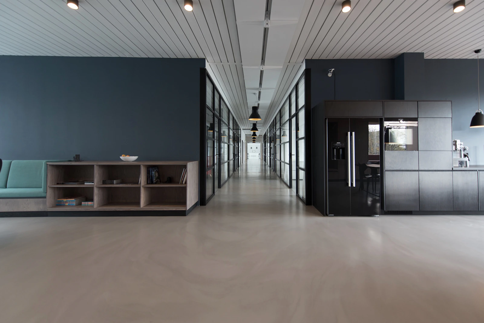
Editorial serif wordmark, an ink-black primary palette with a single vivid accent, and photography direction that shot the team in their offices with the lights on — not against grey stone in a stock-photo lobby. The tone of voice moved from 'trusted advisor' to 'commercial ally'.
Graduate applications up 62% in the following recruitment cycle. Two mid-level partners joined from Magic Circle firms citing the refresh as the reason they took the call.